AI Driven Redesign of Foodpanda's Vendor Menu Module
Mobile first redesign leveraging AI to improve UX, streamline workflows, and reduce manual effort.
Problem Statement
Although vendors were expected to manage their menus independently, many relied heavily on support due to the system's complexity, lack of clarity, and poor mobile performance. Analytics showed that over 60% of interactions focused on just two routine tasks—product availability changes (30.9%) and variant price updates (29.8%) while all other functions saw minimal usage. This suggested that advanced features were either hard to find, difficult to understand, or inefficient to use without assistance.
Key Pain Points:
- Feature Underutilization: Over 60% of actions were limited to product availability (30.9%) and price changes (29.8%), while all other features remained below 5% usage indicating usability and discoverability issues.
- Support Dependency: Despite being a self service tool, many vendors relied on support to complete tasks due to unclear flows and complex interfaces.
- Poor Mobile Experience: Vendors found the UI hard to use on mobile, making on the go management frustrating.
- Choice Group Confusion: Users struggled to differentiate between choice groups and variations, often misapplying them or avoiding them altogether.
- No Efficient Bulk Editing:Vendors had to edit items individually, increasing time spent on routine tasks.
- Approval Process Issues:Price and image updates were frequently rejected without clear reasoning, causing delays and frustration.
- Image Upload Barrier:Vendors rarely uploaded photos due to high rejection rates and the difficulty of taking images that met MQC standards leading to low adoption and overreliance on support.
Goals & Success Metrics
Project Goals
- Enable vendors to complete key tasks without support.
- Simplify frequent actions like availability and price updates.
- Clarify complex features (e.g., choice groups).
- Improve mobile usability.
- Increase adoption of underused features.
- Integrate AI to ease content creation.
Success Metrics
- Task Completion Rate: Targeted +25% increase in self served completion for core actions.
- Support Ticket Volume: To be monitored post launch for reduction in menu related requests.
- Time on Task: Will be measured after go live to assess workflow efficiency.
- Approval Error Rate: Tracked post launch to reduce rejections on images and pricing.
- Feature Adoption: Expected growth in usage of image uploads, bulk editing, and product creation (tracked via analytics after release).
Approach
Research & Insights
Conducted benchmarking, user interviews, and journey mapping to uncover key friction points such as poor navigation, mobile usability issues, and underutilized features due to complexity.
Design Strategy
Developed lo fi wireframes and a mobile-first UI focused on simplifying high frequency tasks (e.g. availability/price updates), improving discoverability, and introducing AI driven tools for photo and content suggestions.
Validation & Iteration
Ran usability tests with 8 vendors to validate the redesigned flows, leading to refinements that improved clarity, reduced support dependency, and increased feature adoption.
Research & User Insights
Benchmarking
We conducted a comprehensive benchmark analysis with leading food delivery platforms including UberEats, DoorDash, Grubhub, and Just Eat to understand industry standards and identify opportunities for improvement.
UberEats
Supports multi menu creation and bulk linking of customizations, but lacks clear editing modes and offers only menu-level availability.
DoorDash
Limited bulk editing capabilities and no support for reusable modifiers make menu management inefficient, especially for larger catalogs.
Grab
Offers detailed availability scheduling and bulk editing, but the interface remains complex and the editing modes require better clarity.
Deliveroo
Supports multiple menu creation and category level option groups, yet lacks smart tools like AI suggestions and advanced reuse logic.
Key Insights
Editing flows are cluttered:
Uber Eats and DoorDash combine too many tasks in a single flow. Grab and Deliveroo are slightly clearer but still not optimal.
Availability control is limited on most platforms
Only Grab offers product-level availability;others rely on less flexible menu/category level setups.
Customization systems are inconsistent
Different terms (Modifiers, Option Groups, etc.) and levels cause confusion; DoorDash lacks bulk linking.
Editing and availability modes are often merged
→ Only Grab and Deliveroo clearly separate them for better task focus.
Reusability features vary widely
Uber Eats allows reuse across categories; others are more restricted.
No platform supports AI-based content creation
Image uploads and descriptions remain manual, causing friction.
Design Opportunities
Separate Quick vs Detailed Edit modes
→ Simplify frequent tasks and reduce cognitive load.
Design mobile-first experiences
→ Ensure smooth access and interaction on mobile devices.
Clarify and streamline choice group logic
→ Use consistent naming and support reuse across items.
Strengthen bulk editing capabilities
→ Enable batch updates for availability, pricing, and links.
Introduce AI-powered content suggestions
→ Help vendors overcome photo upload and approval barriers.
User Persona
Restaurant Owner Profile
Single outlet restaurant owner using Talabat via Vendor Portal. Primarily uses mobile with moderate tech proficiency.
Goals
Quickly update availability and prices
Add/edit items without needing support
Understand and pass photo approvals
Manage everything easily on mobile
Pain Points
Confused by Choice Groups vs Variations
Photo uploads often rejected without clear reason
Hard to find basic actions (add/edit)
Interface feels complex on mobile
Needs
Fast, focused flows for daily tasks
Clear feedback on actions and approvals
Simple UI with tooltips and smart suggestions
User Journey
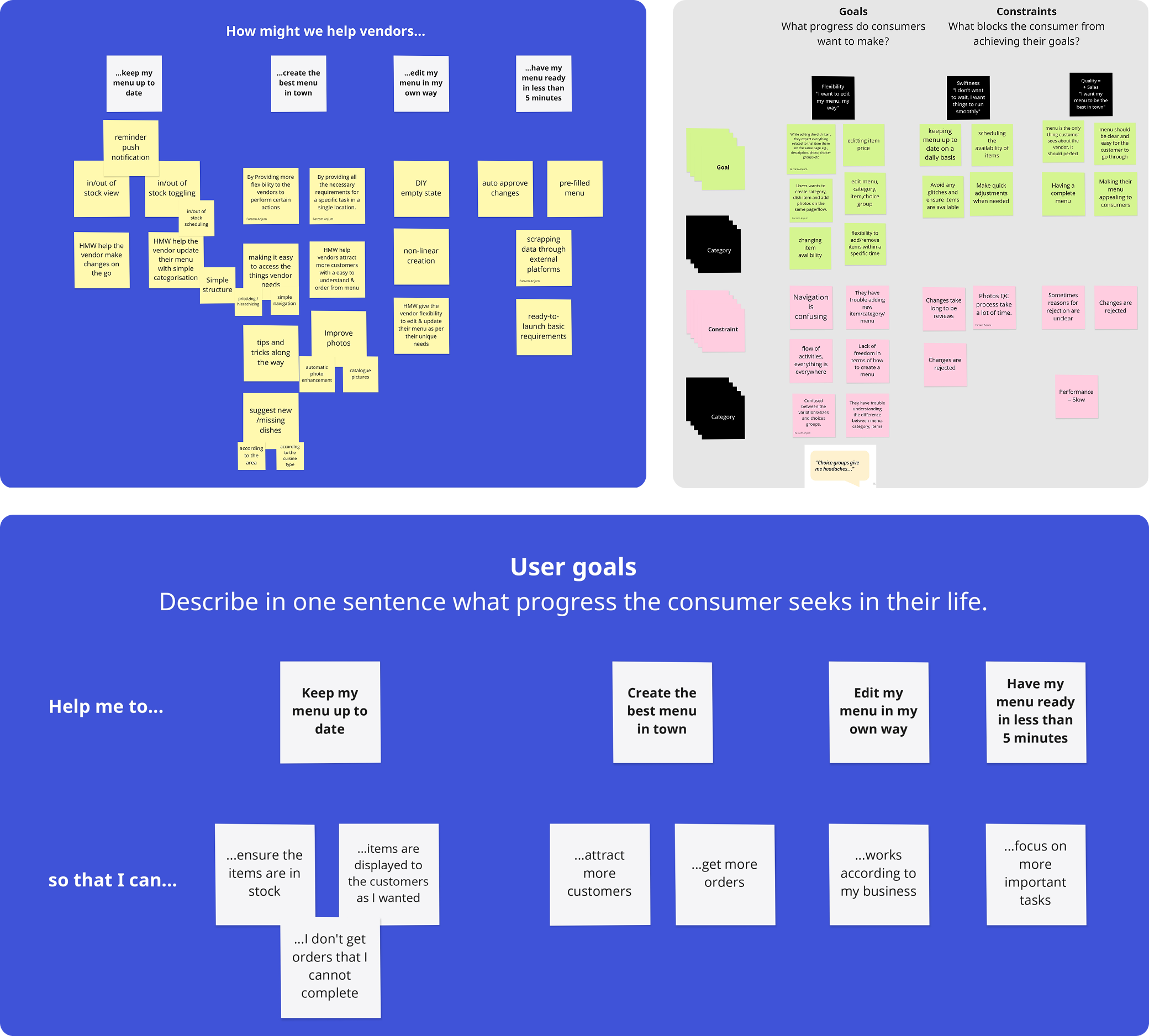
Conducted user interviews sessions with 8 vendors all owners or managers of single location restaurants—to deeply understand their workflows, challenges, and expectations. Creating a user journey helped in gaining insights into vendor behavior, identifying pain points, informing design decisions, highlighting improvement opportunities, and validating design solutions throughout the project's lifecycle.
Key Findings
Vendor Quote: "Choice groups give me headaches."
Workshop for Defining Goals & Constraints
A collaborative workshop was conducted with designers and stakeholders to define clear goals and constraints. This ensured alignment on expectations, provided direction for the design and development process, supported efficient resource use, mitigated risks, and established measurable success criteria.
Usability Testing & Outcomes
Test Overview
- • Menu creation & editing
- • Bulk actions (multi item selection, batch editing)
- • AI generated item descriptions & images
- • Preview & publish flows
- • Mobile vs. Web experience
- • Categorization & visibility settings
Key Outcomes
User Feedback
- • "The AI suggestions saved me hours especially the auto description feature."
- • "Bulk editing was frustrating before. Now, I can update all prices in one go."
- • "Mobile version feels much smoother than before. I can do everything on the go."
- • "Seeing real time preview before publishing made me feel more confident."
- • "It was confusing before to find visibility settings. Now it's clearly labeled."
Validated Through Usability Testing
Two Editing Modes & Adding New Item
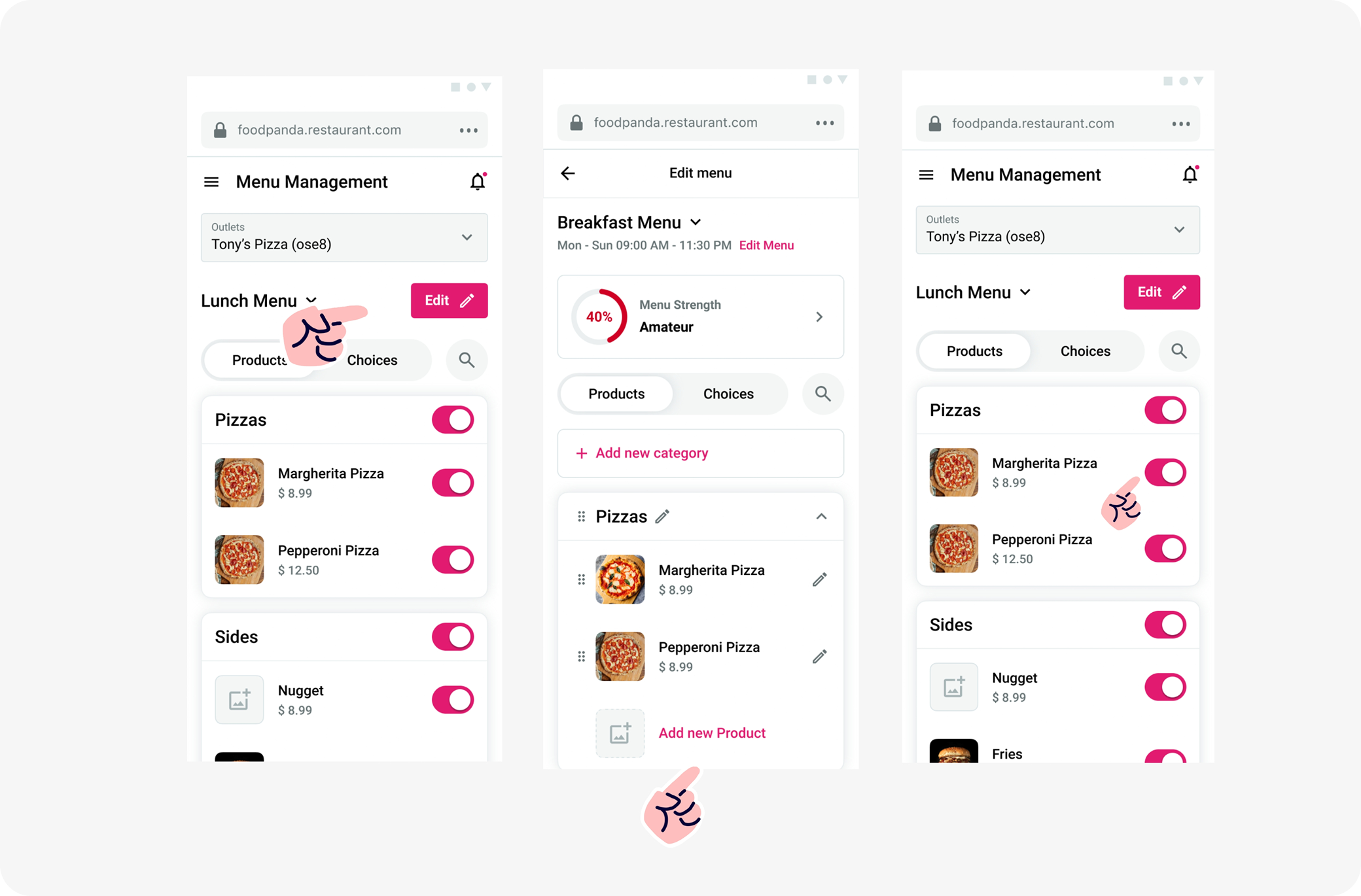
Why it was designed
Vendors struggled with mixed edit flows, causing confusion and delays.
We introduced Two Editing Modes:
- • Quick Edit for high frequency actions like toggling availability
- • Detailed Edit for tasks like changing prices, descriptions, or images
Testing Results
- • 7/8 found the edit button on their own
- • 8/8 completed add item task
- • ~90% overall task completion rate
User Feedback Highlights
- • "It's clear what to do now. I don't have to scroll or guess."
- • "I liked that I didn't have to go through too many steps just to add a dish."
- • "The toggle for availability is much easier than before."
- • "It's good to have both modes. I only use the simple one most of the time."
Choice Groups (Size Options)
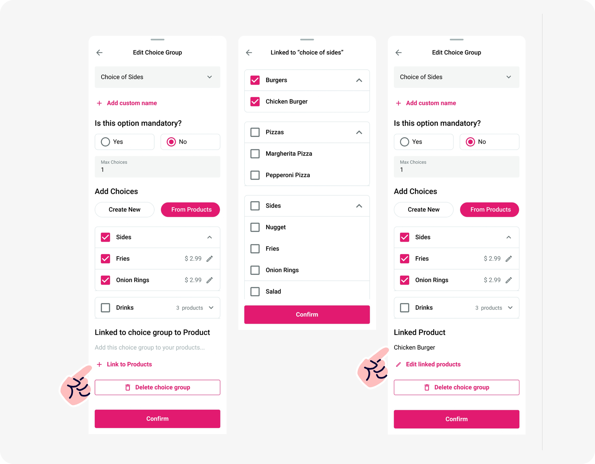
Why it was designed
Vendors often created separate products for different sizes instead of using modifiers due to unclear group setup. The redesign introduced a cleaner, mobile friendly way to create size based options with clearer labels, pricing, and selection rules.
Testing Results
- • 6 out of 8 vendors created size options (e.g., Regular/Large) successfully
- • Most found the "Create New" flow easy; some missed "From Products" at first
- • Reduced duplication behavior compared to earlier design
User Feedback
- • "Creating size options directly here is much faster."
- • "I didn't realize I could reuse existing products at first."
- • "The layout is clearer now especially the required and max selection part."
Choice Groups vs Variations
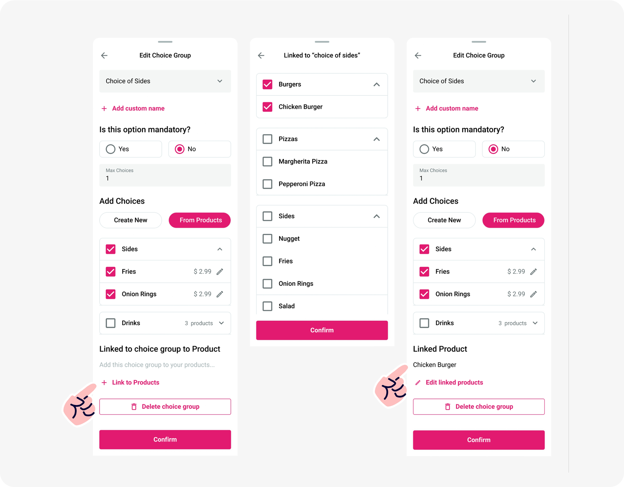
Why it was designed
Vendors were unclear about when to use Choice Groups versus Variations, often duplicating products instead of using modifiers. The redesign clarified this by streamlining group creation, linking, and making modifier logic more intuitive and reusable.
Testing Results
- • 5 out of 8 vendors used Choice Groups correctly
- • 3 vendors hesitated or reverted to old habits (like duplicating items)
- • Reusability and linking features were better understood than before
User Feedback
- • "This helps me avoid creating the same product twice."
- • "Linking products is easier now, but I didn't see the button right away."
- • "I still confuse variations and options sometimes, but it's more usable."
AI Content Suggestions From Insight to Design
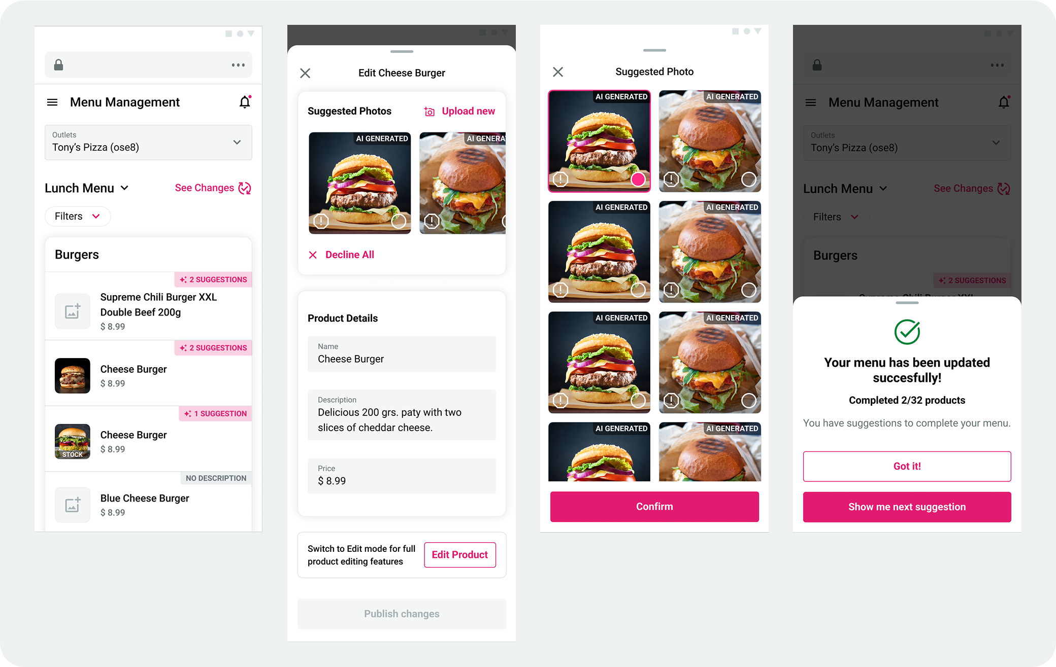
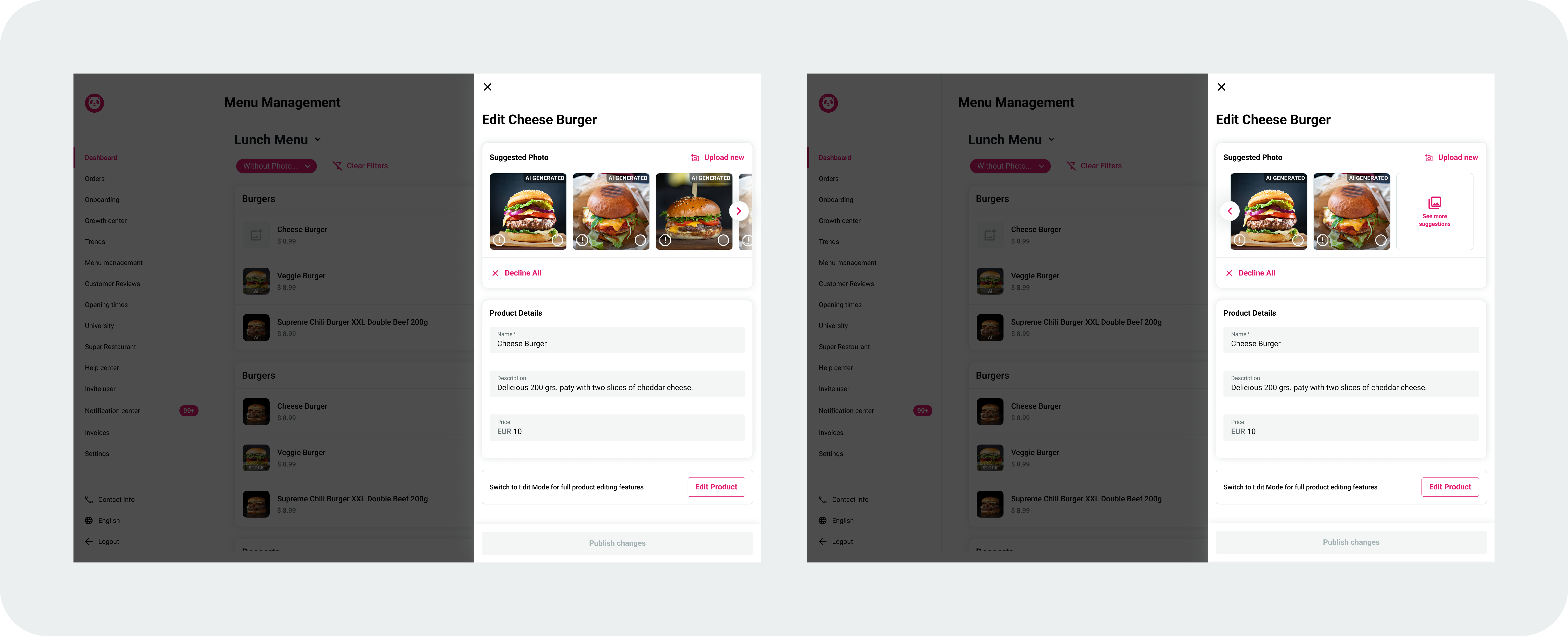
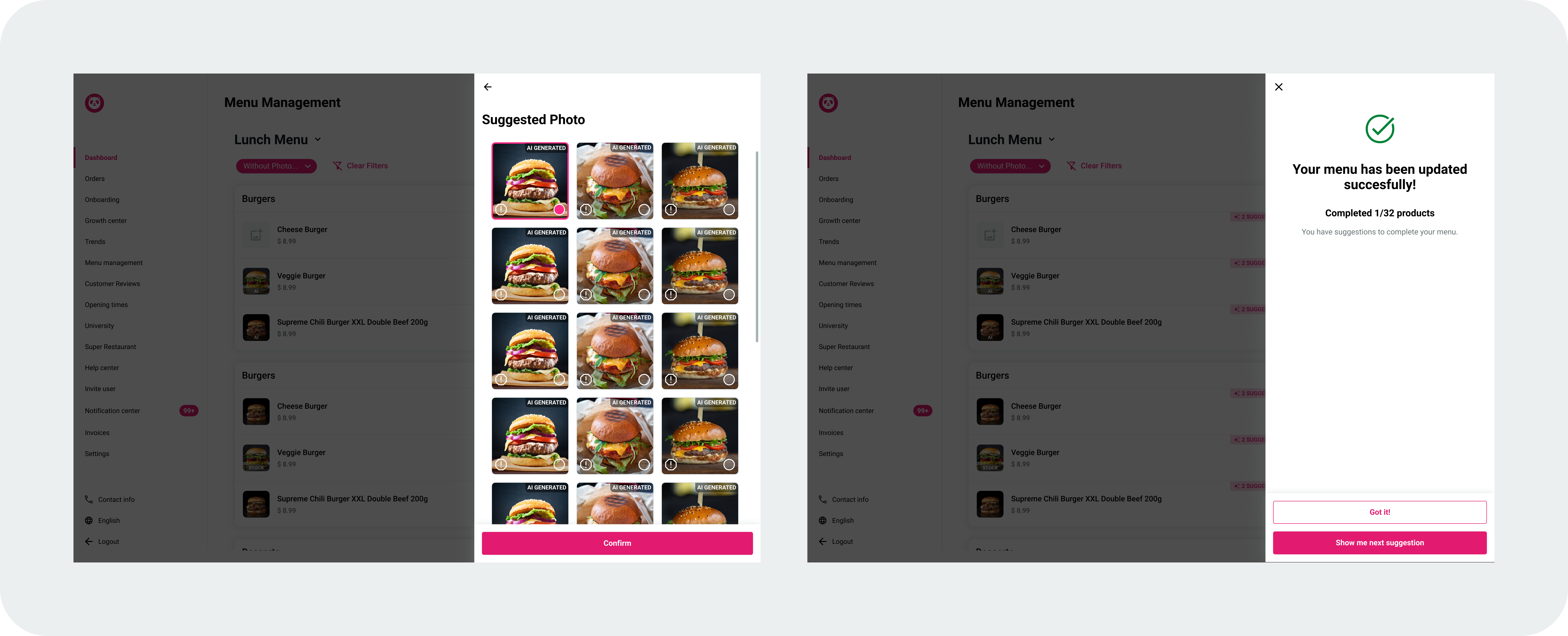
Why it was designed
During early usability testing, vendors were asked whether they would consider using AI generated images and descriptions.
5 out of 8 vendors expressed interest mainly to save time and avoid photo rejections but also voiced concerns about authenticity.
This insight informed the design of a suggestion system that balances automation with control.
Testing Results (Follow-up usability sessions)
- • 100% of vendors completed the AI suggestion task with ease
- • All participants found and used the feature intuitively
- • No confusion was observed during use
- • Vendors easily recognized and managed AI tagged content
User Feedback
- • "This saves me so much time. I don't have to take my own photos."
- • "As long as it looks like my dish, I'm okay using it."
- • "The suggestion label is helpful. I know which items still need edits."
Impact & Key Learnings
Successfully redesigned the Foodpanda Vendor Portal with a focus on mobile first design, AI integration, and streamlined workflows. The new system significantly improved vendor satisfaction while reducing operational costs through intelligent automation. The project demonstrated the power of combining user centered design with cutting edge AI technology to solve real business problems.
Impact
Key Learnings
Next Step
To further validate and scale the redesign, upcoming efforts will focus on
Validation & Testing
- Conducting usability tests with chain restaurant vendors
→ To evaluate how the new structure supports more complex operational needs and team based workflows
- Testing with vendors managing multiple menus
→ To ensure flexibility and clarity for locations that require separate menus by branch, time, or brand
Feature Enhancements
- Expanding AI content suggestions
→ Including more localized image sets and tailored descriptions based on cuisine type
- Collaborating on onboarding improvements
→ Although onboarding is owned by a separate team, our changes impact early user experience. We've shared findings with their designers and will continue to collaborate to integrate insights especially around advanced features like Variations—into their flows.