Redesigning Yemek.com: A Modern Recipe Platform
The recipe app experience was reimagined to enhance clarity, improve navigation, and foster user engagement through data-informed design.
Problem Statement
Yemek.com users faced significant challenges in discovering relevant recipes, managing their personal recipe collections, and navigating the platform efficiently. The existing interface lacked modern design principles and failed to meet user expectations for a contemporary recipe platform.
Current Challenges
- Complex and outdated user interface design
- Limited search and filtering capabilities
- Poor recipe discovery and recommendation system
- Inadequate mobile experience and responsiveness
- Lack of personalized user experience
Key Pain Points
User interviews highlighted frequent confusion in navigating core categories.
Many users needed multiple keywords to find relevant recipes.
Session durations on mobile were 30% shorter than desktop.
Users lacked folders or tagging for saved recipes.
Category pages had a bounce rate over 50%, indicating low content relevance.
Goals & Success Metrics
Project Goals
Modernize the Yemek.com platform to meet current UX/UI standards.
Enhance search and filtering for quicker recipe discovery.
Improve mobile usability to increase engagement on smaller devices.
Create a personalized user experience tailored to cooking preferences.
Increase content accessibility and visibility across categories.
Build a scalable UI system for consistent future updates.
Success Metrics
Time on Site
Goal: Increase average session duration on mobile by +20%, indicating improved engagement.
Bounce Rate (Category Pages)
Goal: Reduce bounce rate from category pages by 15% through better content relevance.
Search-to-Recipe Success Rate
Goal: Improve successful recipe finds per search session by +25% based on user flow tracking.
Saved Recipes Interaction
Goal: Track increased use of the "Save" feature post-redesign, targeting a +30% increase.
User Satisfaction
Goal: Achieve 80%+ satisfaction in post-launch user surveys regarding navigation and mobile usability.
Research & User Insights
Persona
Seren – The Practical Home Cook
Age: 29
🧠 Goals
- • Find quick, reliable, and healthy recipes after work
- • Discover new meal ideas based on what's in the fridge
- • Save and organize go-to recipes for reuse
- • Share successful recipes with friends or on social media
😖 Pain Points
- • Recipe platforms are cluttered and hard to navigate
- • Most platforms don't allow saving or categorizing favorite recipes
- • Lacks filters to sort by ingredients on hand or prep time
- • Gets overwhelmed by long blog-style introductions in recipes
- • Mobile experience is not optimized — hard to use while cooking
📱 App Usage Behavior
- • Uses recipe apps like Yemek.com, Nefis Yemek Tarifleri, Instagram food creators
- • Searches by ingredient first ("What can I cook with eggplant and yogurt?")
- • Often filters for "under 30 minutes" or "low calorie" meals
- • Scrolls for visuals first before reading details
User Interview Insights
We conducted interviews with 14 users based on our defined personas. The goal was to understand their cooking habits, app usage behavior, and expectations from a recipe platform.
Key insights included:
Affinity Mapping
To deeply understand user needs, pain points, and feature expectations, we conducted 14 user interviews and analyzed over 100 user comments gathered from Google Play, App Store, and other public platforms. These insights were grouped using an affinity map to uncover recurring patterns and prioritize design decisions.
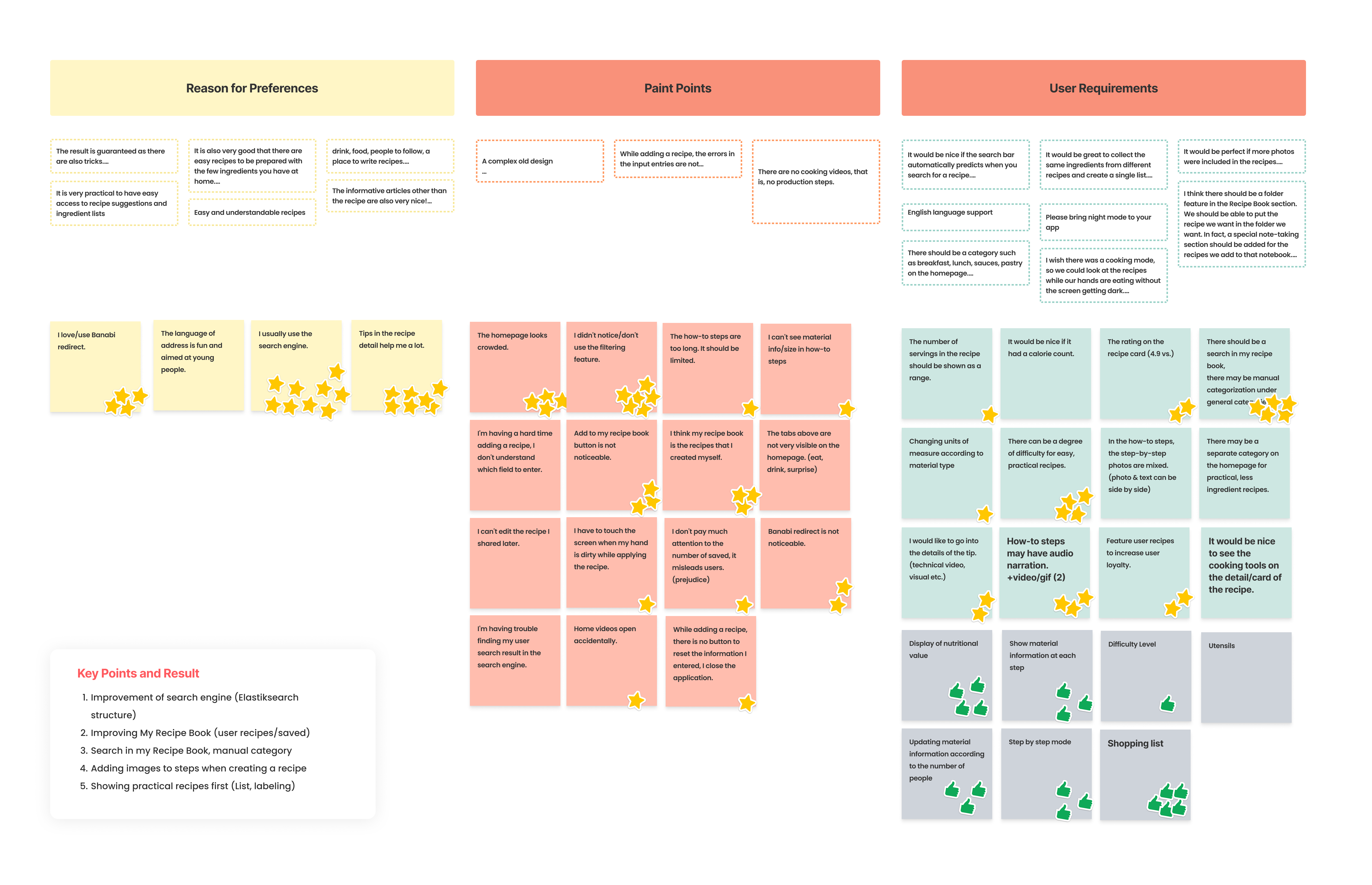
Key Findings:
Discovery & Search Frustration:
Users had trouble finding what they were looking for due to limited filters and a lack of visual categorization.
"I wish I could just filter by cooking time or ingredients I already have."
Organization & Recipe Management:
Many users wanted better tools to save, organize, and access favorite recipes.
"I save so many recipes, but can't find them later unless I scroll forever."
Cooking Experience Issues:
Users found long recipe blocks hard to follow while cooking. They preferred step-by-step instructions with images.
"I want clear steps and photos. I can't scroll and stir at the same time."
Desire for Personalization:
There was high interest in features that adapt to individual needs like dietary preferences or cooking goals.
"I'm vegan — I wish it didn't always show me meat recipes first."
Trust through Community Content:
People trusted recipes more when they included user comments or photos.
"If I see others tried it and shared pictures, I trust it more."
These insights formed the foundation for our design strategy and helped us prioritize solutions that would create a more intuitive, personalized, and motivating cooking experience.
Competitive Analysis

Market Analysis
- • Analyzed leading recipe platforms and their feature sets
- • Identified gaps in current market offerings
- • Evaluated user experience patterns across competitors
- • Assessed mobile vs desktop usage trends
Key Differentiators
- • Enhanced search with photo recognition capabilities
- • Comprehensive recipe management system
- • Advanced filtering and categorization options
- • Integrated social features for recipe sharing
Design Solutions
Information Architecture
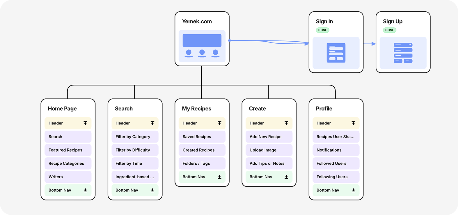
Wireframes
Low-fidelity wireframes were created to outline core layouts and user flows. The focus was on improving recipe discovery, search usability, and personal recipe management. These wireframes helped validate ideas early and served as a foundation for the final UI design.
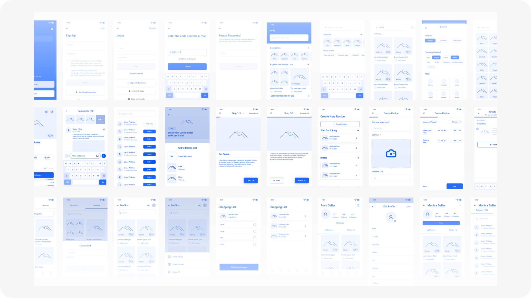
Design System
A scalable UI library was created to ensure consistency across the app. It included:
Core Components
- Base styles for colors, typography, spacing
- Core components like buttons, inputs, tags
- App-specific elements such as recipe cards and timers
Implementation Benefits
Responsive variants and interactive states were defined to support mobile use and developer handoff.
This design system streamlined the UI process and supports future growth.
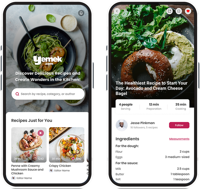
UI Design
Home & Search Experience
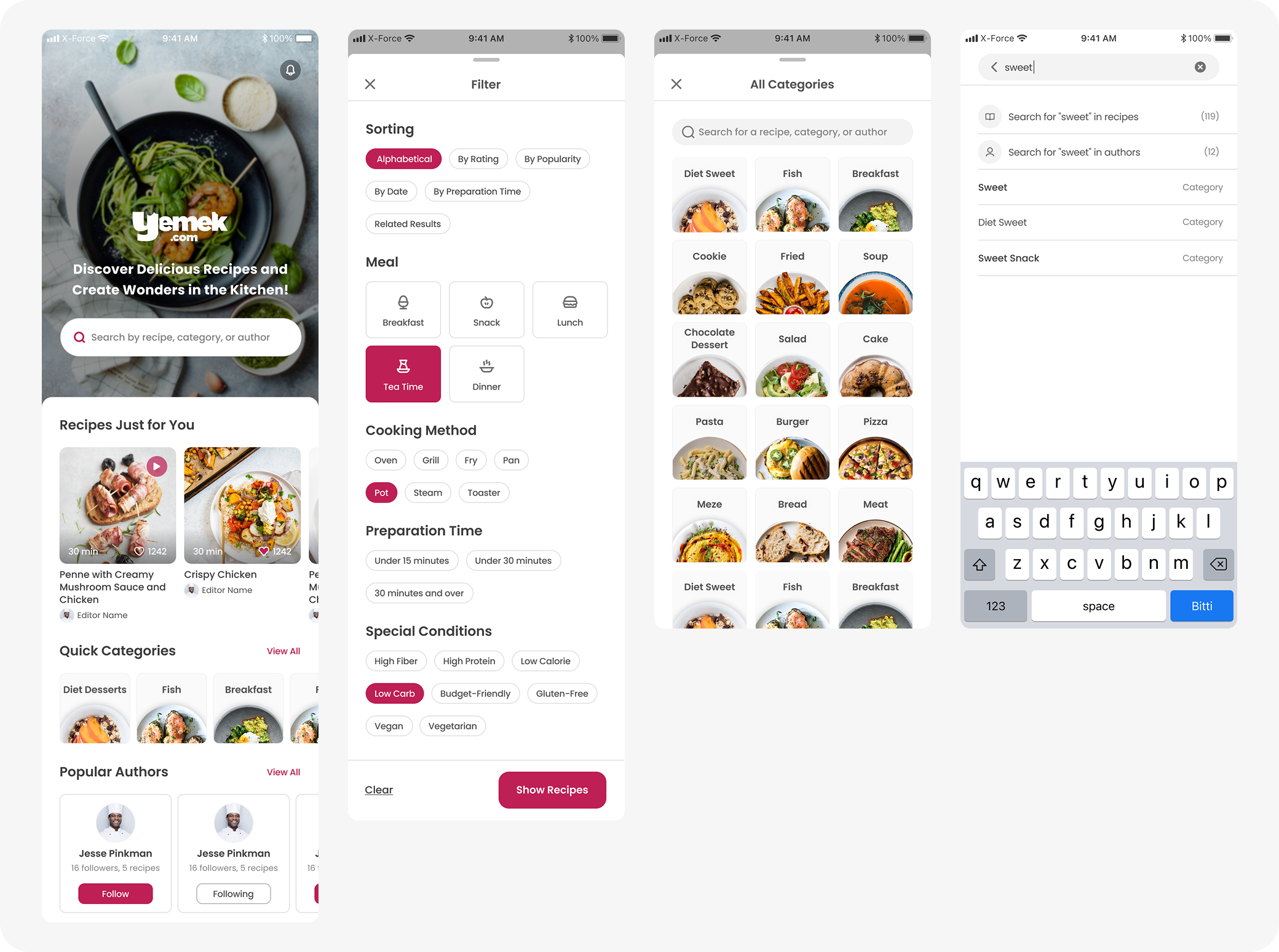
Why It Was Designed
Users had difficulty discovering relevant recipes due to limited filtering, non-visual category lists, and a basic search experience. Comments and analytics showed users often abandoned search when they couldn't find what they were looking for quickly or visually.
What Improved
We redesigned the filter panel to allow multi-dimensional sorting (meal type, prep time, cooking method, diet). Categories were restructured visually for easier scanning. Smart search suggestions were added to improve speed and accuracy in finding recipes.
Recipe Details & Cooking Mode
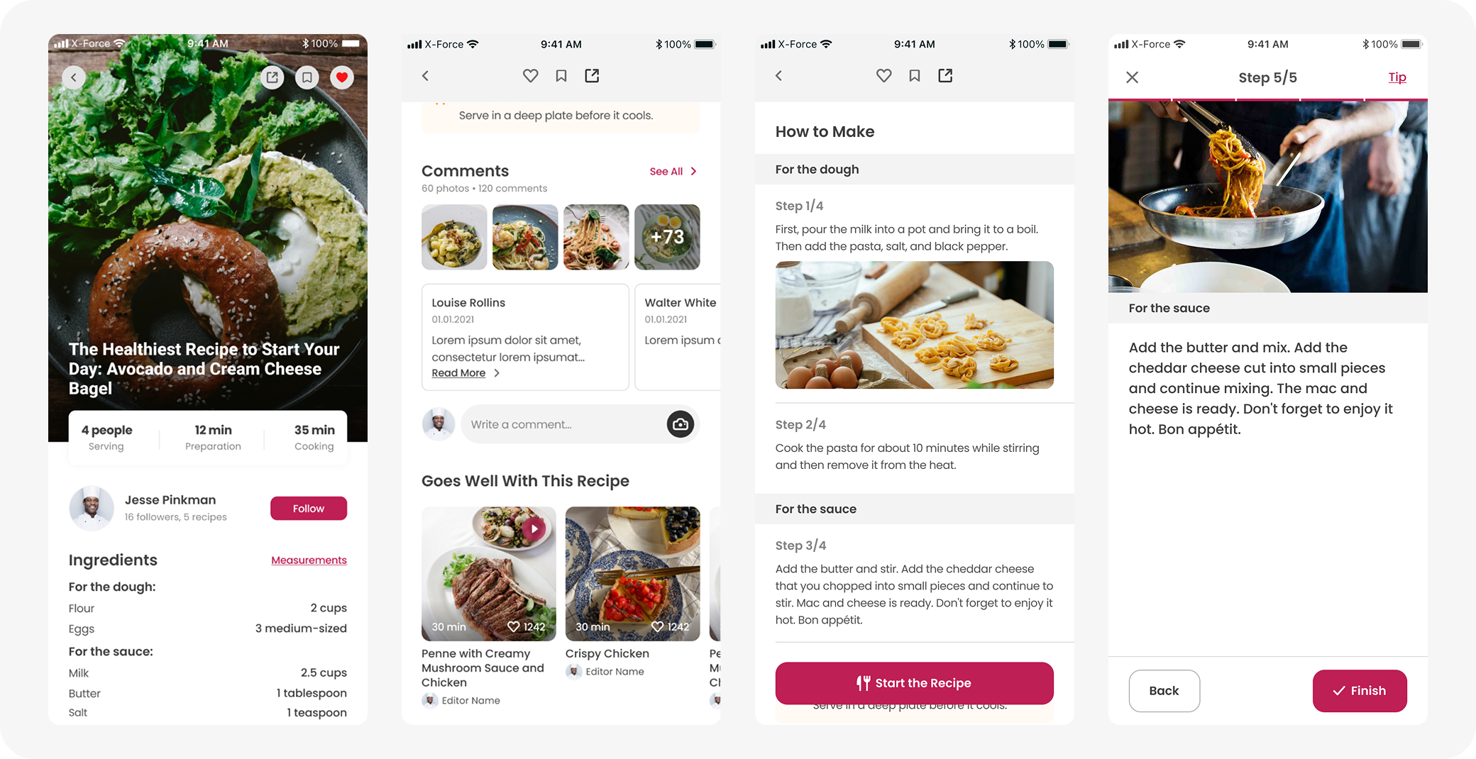
Why It Was Designed
Users needed a clearer, distraction-free cooking flow and struggled to follow long recipe texts. The old layout didn't support step tracking, didn't highlight similar recipes, and lacked visible community feedback.
What Improved
- • Added a scrollable Cooking Mode for step-by-step instructions
- • Improved layout clarity for ingredients and timing
- • Highlighted user comments and similar recipes
- • Included clear CTAs like "Start" and "Finish" for better flow
Recipe Management & Lists
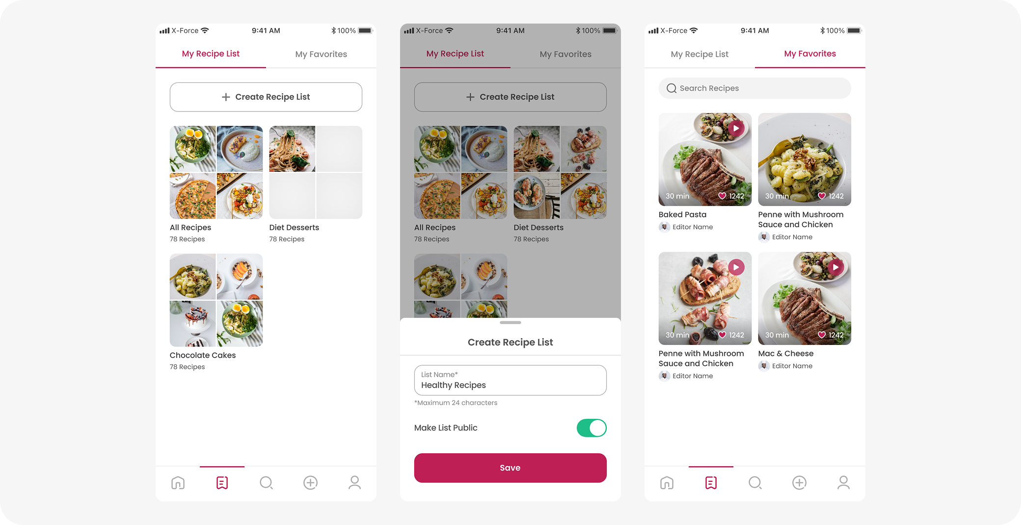
Why it was designed
Users wanted a better way to organize and revisit recipes. The old system lacked grouping, public sharing, and easy access to saved content, making management difficult.
What Improved
- • Introduced custom recipe lists with editable titles
- • Added favorites tab for quick access
- • Enabled public/private toggle for shared inspiration
- • Created a clean, visual layout for list previews
Recipe Creation & Sharing
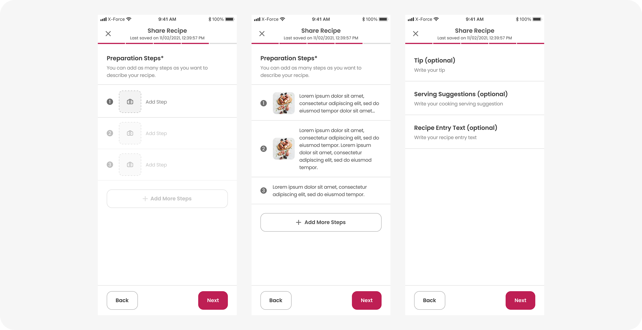
Why It Was Designed
- • Users needed a structured and flexible way to share recipes.
- • Existing flow lacked step-by-step clarity and visual cues.
- • No space for tips or serving suggestions.
- • Users wanted reassurance that their content wouldn't be lost mid-entry.
What Improved
- • Added multiple steps with optional images.
- • Included optional fields: tips, serving suggestions, and recipe intro.
- • Step-by-step navigation with Back/Next buttons.
- • Auto-save feature with visible timestamp.
User Profiles & Social Features
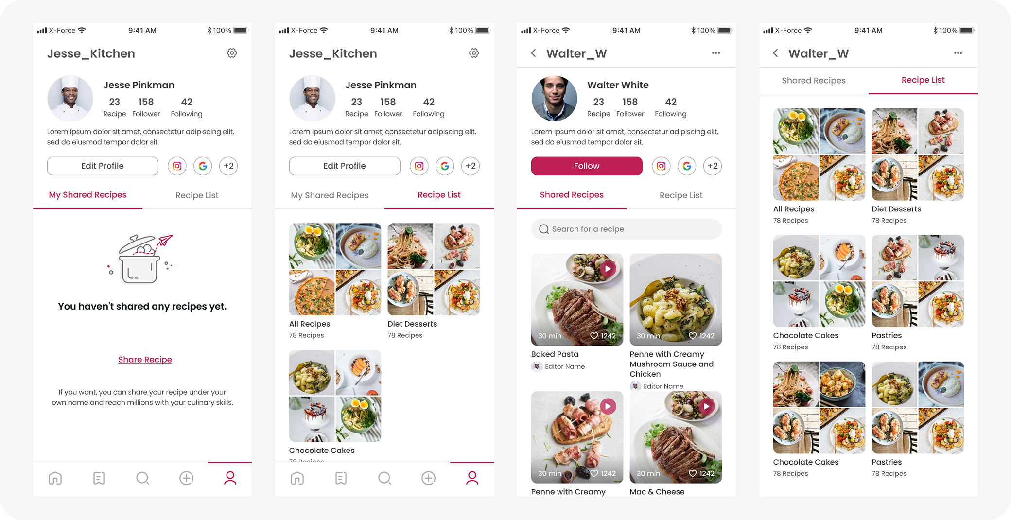
Why It Was Designed
- • Users wanted to showcase their shared recipes under their own profiles.
- • There was no way to explore others' recipe collections or follow favorite authors.
- • Lack of social presence reduced engagement and repeat visits.
- • Users asked for a simple space to edit their profile and track content.
What Improved
- • Introduced public user profiles with follower/following counts.
- • Enabled recipe list sharing for other users to browse and save.
- • Added a clear toggle between "Shared Recipes" and "Recipe List."
- • Included social links and easy-to-use "Edit Profile" and "Follow" buttons.
Impact & Key Learnings
Impact
Enhanced Recipe Discoverability
Improved recipe discoverability through enhanced search, filtering, and tag systems.
Increased Feature Usage
Post-launch data showed a 32% increase in users utilizing advanced search filters (e.g., cooking time, ingredients).
Improved Task Completion
Simplified navigation contributed to a +28% increase in successful task completion for key actions like saving or sharing a recipe.
Higher User Engagement
The redesigned layout and visuals resulted in higher engagement, with users spending more time exploring new categories and community content.
Key Learnings
Personalization Matters
Ingredient-based search and "just for you" sections resonated strongly with users.
Structured Cooking Mode
A structured, visually clear cooking mode improves usability and reduces cognitive load, especially on mobile.
Social Features Drive Engagement
Social and community features (like recipe sharing and following) help build long-term engagement when made easy to discover.
Small UI Improvements Matter
Even small UI improvements (e.g., favorites tab, recipe folders) can significantly impact retention when tied to user needs.
Next Steps
Monitor Key Metrics
We've already begun tracking key metrics such as recipe discovery and completion rates. This tracking will continue to validate design impact with real user data.
Iterate Based on Live Feedback
Continuous improvements will be made based on user behavior analytics and feedback collected from the live platform.
Expand Personalization Features
Work will continue on refining personalized content and recommendations to increase engagement and relevance for individual users.
Explore Recipe Creation Flow
Further research, including user interviews and usability testing, will be conducted to improve the recipe creation experience.
Download the App
Experience the redesigned Yemek.com app with enhanced recipe discovery and improved user experience.