Monevo: Gamified Financial Habits
Designing a gamified approach to financial wellness that helps users distinguish between wants and needs while building healthy spending habits through engaging interactions.
Problem Statement
Monevo faced poor onboarding completion, low user engagement, and weak motivation mechanisms. Users struggled with understanding financial concepts, navigating the app, and staying committed to tasks leading to high abandonment and retention issues.
Key Pain Points:
- High Onboarding Drop-off: 52.6% of users abandoned the welcome screen; only 47.4% completed onboarding.
- Sharp Retention Decline: Retention dropped from 85.3% (first open) to 28.8% (onboarding complete).
- Low Task Engagement: Only 32.6% of users accessed the task list, with a task completion rate of 8.1%.
- Generic & Unclear Guidance: Users were confused by financial terms, unengaging tasks, and the lack of personalized onboarding.
- Wasted Acquisition Costs: Poor onboarding and retention undermined user acquisition efforts and revenue opportunities.
Goals & Success Metrics
Project Goals
Success Metrics
Approach
Research & Discovery
Benchmarked gamified and financial apps, mapped user journeys, and reviewed analytics to identify pain points and motivation gaps.
Ideation & Design
Created wireframes and task flows focused on gamification and clarity, including personalized tasks and streamlined onboarding.
Validation & Iteration
Tested with users and collected feedback through wireframe testing sessions and iterated designs based on user insights and engagement metrics.
Research & User Insights
Benchmarking
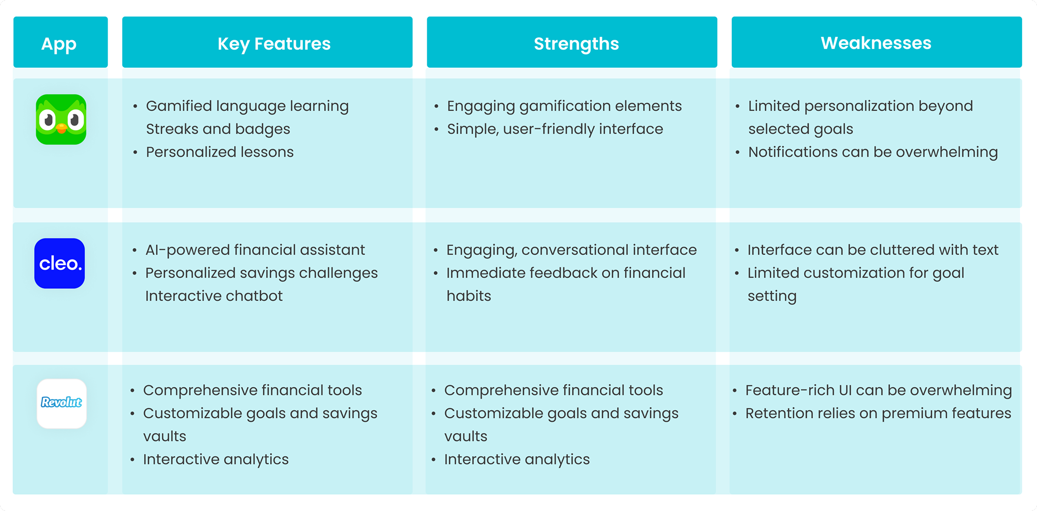
Key Insights
- • Duolingo's gamification model proves highly effective for habit formation
- • Cleo's conversational interface engages users but lacks comprehensive tools
- • Revolut offers robust features but can overwhelm new users
Our Differentiators
- • Focus on want vs. need categorization
- • Educational content integrated into daily interactions
- • Potential for cashback and brand based rewards, offering real world value to users unlike most competitor apps.
User Persona
Home Economists
Age range: 32-50 years old
Users managing family finances, looking for practical savings tips and stress-free budgeting tools.
Professionals
Age range: 23-32 years old
Career driven individuals seeking, paying off debt or loans, smart financial management, tend to purchase more than they actually need, motivated by rewards and goal tracking.
These personas, based on client led research, ensured the onboarding, gamified task system, and financial content were tailored to meet diverse user needs.
User Journey Mapping
Key Insights
Users faced unclear guidance, overwhelming onboarding, low motivation, confusing visual design, and a lack of understanding around key features like the Monay Score. Our research highlighted the need for simpler language, streamlined flows, personalized goal setting, and clearer visual hierarchy to improve the overall experience and drive engagement.
Design Strategy
Progressive Learning
Broke down complex financial concepts into small, manageable steps to reduce cognitive load.
Gamification
Built habit loops using points, badges, and rewards to drive ongoing engagement.
Personalization
Tailored tasks and goals based on user types, aligned with AI logic through collaboration with developers.
Visual Clarity
Used a clean visual hierarchy and chat based guidance to improve comprehension and ease of use.
Guided Structure
After testing sequential and open task flows, we moved forward with a structured approach to support goal setting and reduce decision fatigue.
Key Design Solutions
Usability Testing & Outcomes
Test Overview
- • Onboarding & welcome screens
- • Getting to know you series
- • Expense entry & categorization (Wants vs. Needs)
- • Navigating My Monay World
- • Viewing reports & identifying spending patterns
- • UI feedback on homepage alternatives
Key Outcomes
User Feedback
- • "I didn't understand what Wants vs. Needs meant at first the explanation helped a lot."
- • "The chat reminders felt like a coach guiding me through."
- • "Seeing my most spent category made me rethink my priorities."
- • "I liked being able to choose my own reward it felt more personal."
- • "Without the visual cues, I wouldn't have known where to go next. This version made it obvious."
Validated Through Usability Testing
Welcoming Screens
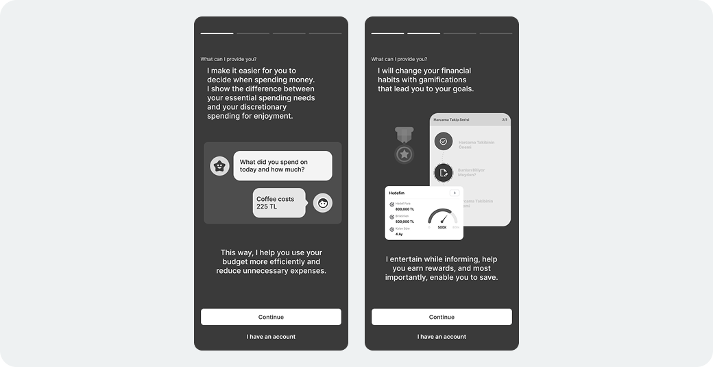
Why it was designed
The old welcome screen lacked clarity and failed to explain the app's value, leading to early drop offs. We redesigned it to showcase key features like gamification and financial education using visuals and app previews helping users quickly understand what to expect.
Testing Results
- • Previous drop-off rate at welcome screen: Over 50% did not proceed after the first open
- • Post-redesign (usability testing): 70% of users continued into the first series and more users motivated to explore
- • Users who described the welcome experience as "inviting" or "clearer than expected": 85.7%
User Feedback
- • "I understood what the app was about before signing up that made a difference."
- • "The visuals helped me see that it wasn't just another finance app."
- • "I felt like I was being introduced, not just dropped into something."
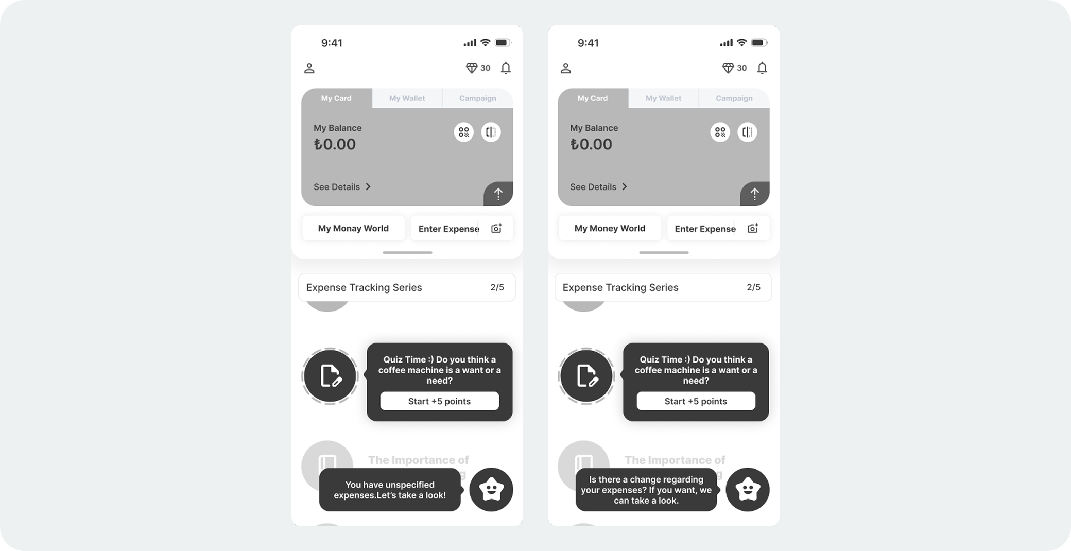
Gamified Onboarding via "Getting to Know You" Series
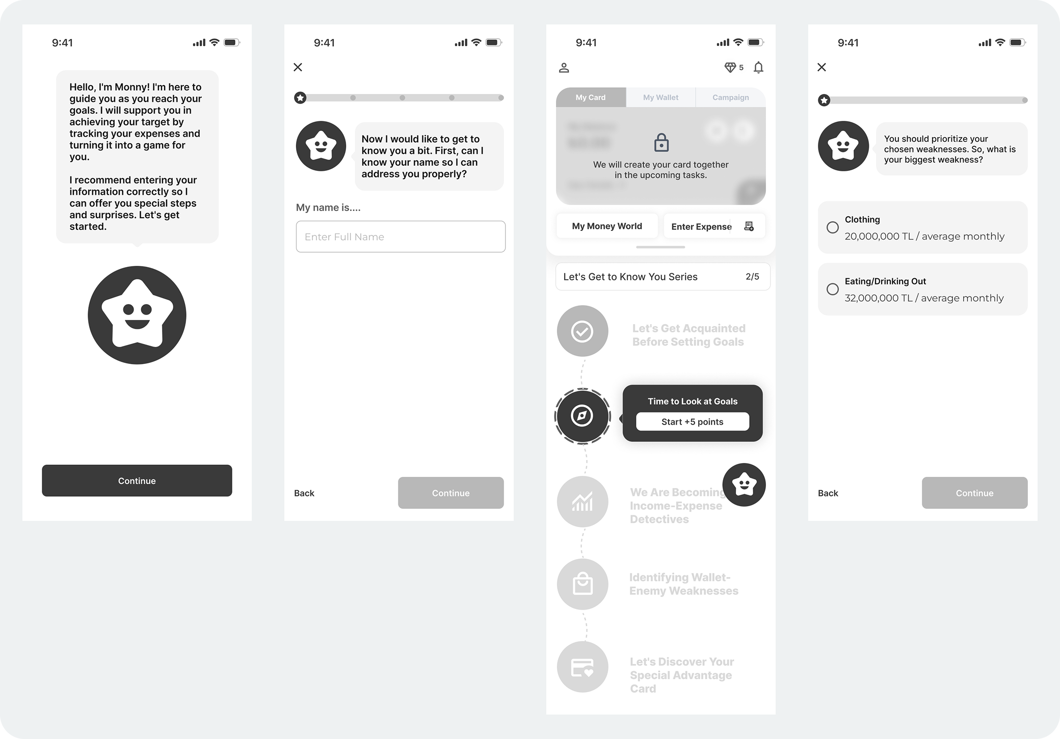
Why it was designed
In the old version of the app, users were asked to enter personal and financial information right after opening the app leading to a 52.6% drop off at the welcome screen. The onboarding felt tedious and overwhelming, causing many to abandon before engaging with the product. To solve this, we restructured onboarding as a gamified task series called "Getting to Know You." Instead of traditional forms, users completed small, interactive tasks (e.g., "Tell us about your financial goals") and earned points upon completion. This approach helped reduce friction, improve engagement, and gave users an early sense of achievement.
Testing Results
- • Onboarding Completion Rate: Increased from 47.4% → 70% (+47.6%)
- • Drop-off at welcome screen: Reduced from 52.6% → under 30%
- • Users reporting onboarding as "clear and engaging": 85.7% during testing
User Feedback
- • "It felt like a journey, not a boring form."
- • "I wanted to keep going to see what came next and get the points."
- • "Much better than being asked for everything upfront I actually completed it."
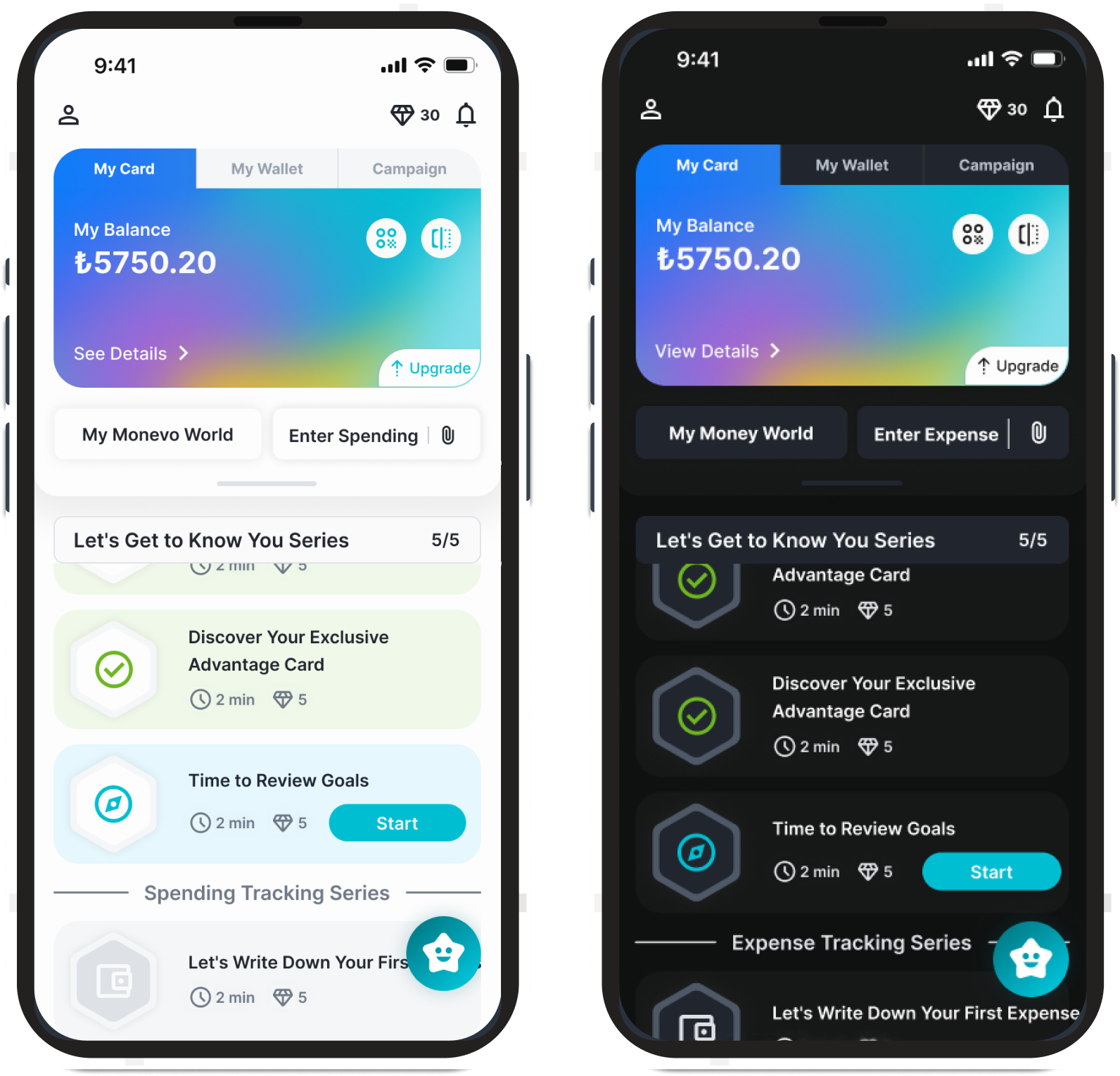
My Monevo World
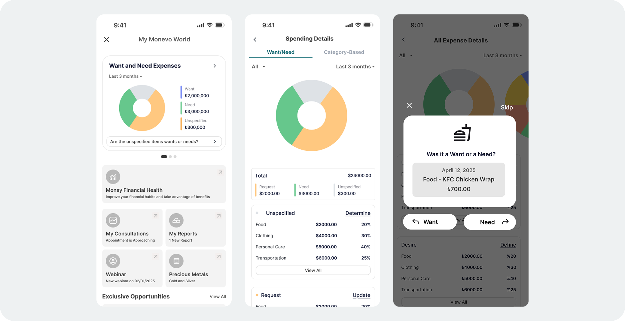
Why it was designed
My Monay World was created to help users visually track progress and stay motivated through a gamified journey. At the same time, it also served users who prefer a more practical, finance-focused approach enabling quick actions like viewing insights, accessing expert advice, or buying valuable metals, without relying heavily on gamification.
Testing Results
- • Users who accessed and explored My Monay World: 85.7%
- • Users who understood their progress and rewards within the space: 85.7%
- • Task motivation & feedback increased based on post-task interview responses
User Feedback
- • "I loved seeing my progress. it felt like I was actually getting somewhere."
- • "This made the app feel more fun and less stressful."
- • "I like that I can both track and take action without digging through menus."
Receipt-Based Expense Input
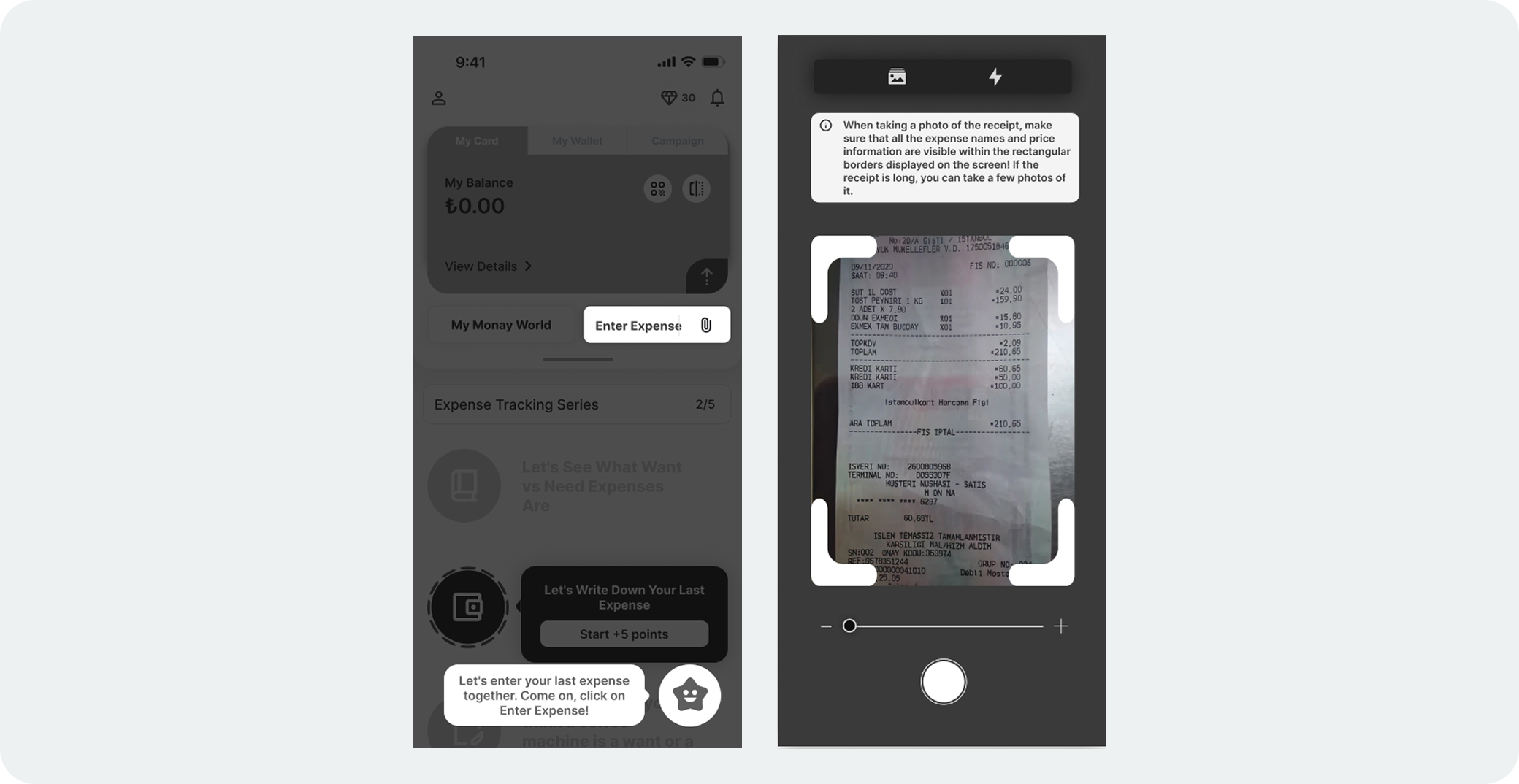
Why it was designed
Users found manual expense entry time consuming and prone to skipping. To streamline the process and increase accuracy, we introduced a receipt-based input option, allowing users to upload or scan receipts directly. This also supported better tracking for users managing shared or recurring expenses.
Testing Results
- • Users who preferred receipt-based input over manual entry: 71.4%
- • Reported ease of use (from post-test interviews): 85.7% found it "easy" or "very easy"
- • Perceived usefulness for monthly reports: 72% said it made tracking feel more reliable
User Feedback
- • "Uploading a receipt felt faster and easier than typing everything."
- • "It's helpful when I split bills with someone."
- • "This saves me from forgetting what I spent on."
Goal-Based Task Series & Reward System
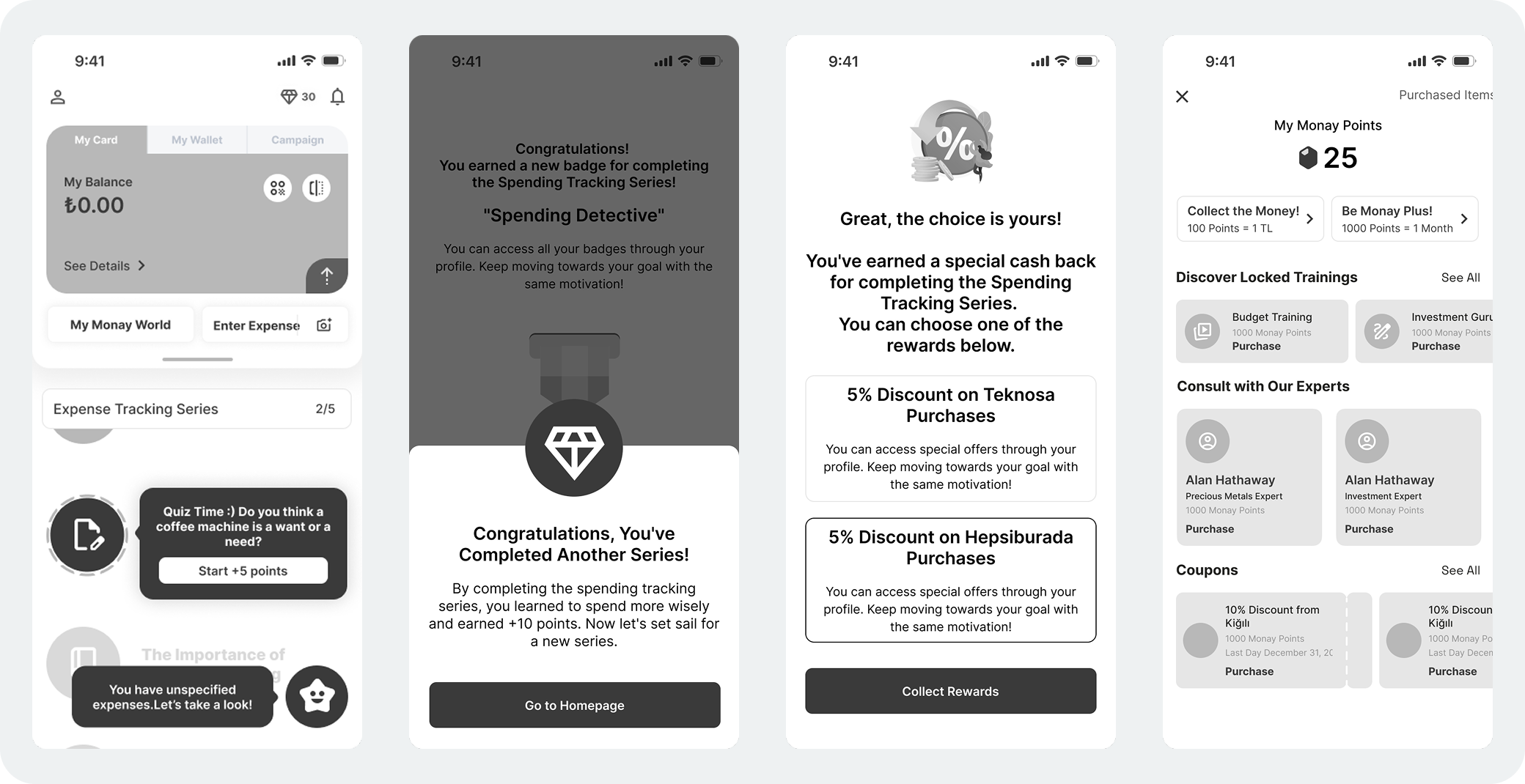
Why it was designed
In the previous version, users earned points but had no way to use them making the system feel empty and demotivating. To fix this, we introduced a store where users can redeem their points. We also created goal-based task series (e.g., Expense Tracking for users paying off debt), each consisting of 5 or 6 short tasks and mini quizzes to avoid fatigue. At the end of each series, users receive a congratulatory message, earn points, and get to choose a reward, turning progress into a clear and motivating experience.
Testing Results
- • Task completion (within series): Increased from 8.1% → 15% (+85.2%)
- • Users who preferred series based flow over isolated tasks: 71.4%
User Feedback
- • "It was satisfying to finish a full series it felt like a win."
- • "I actually care about the points now because I can use them."
- • "Choosing my own reward made it feel more personal and fun."
Testing Two Homepage Variants
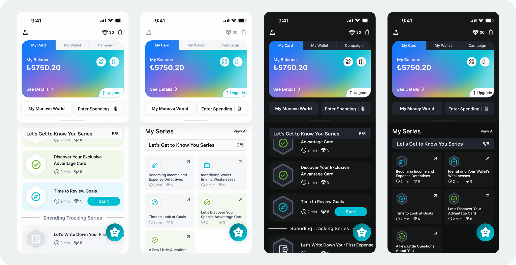
Why it was designed
The original homepage lacked structure and clarity users struggled to understand where to start and which features were most important. To improve this, we designed and tested two homepage variants: one with sequential task cards, and another with open access task blocks. The goal was to find the layout that best supports task engagement and ease of navigation.
Testing Results
- • Users who preferred sequential tasks: 3 out of 7
- • Users who preferred open access structure: 2 out of 7
- • 1 user liked both equally
- • Final Decision: Moved forward with the sequential layout to guide users step by step and reduce decision fatigue
User Feedback
- • "The step by step layout made me feel more focused."
- • "I liked having everything visible, but I wasn't sure where to begin."
- • "The card based version felt more like a journey, which helped me stay on track."
Feature Enhancements Based on Usability Testing
Most-Spent Category and Smart Reminders
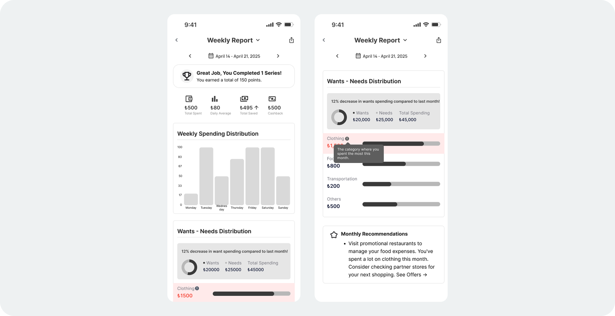
Why it was designed
Most-Spent Category in Reports
Users wanted a clearer view of where they overspent, especially in monthly summaries. The original reports lacked visual focus, so we redesigned them to highlight the most spent category using clear labels and visual cues. “I want to know instantly where my money went the most.”
Smart Reminders via Chat Assistants
Users often forgot to classify expenses or complete tasks without prompts. While push notifications were mostly ignored, in app chat reminders felt more personal and effective. We added smart reminders triggered by behaviors like unclassified spending or inactivity, delivered through the chat assistant in a friendly tone. “Push notifications feel robotic, but in-chat felt like someone was guiding me.”
Expected Impact
Most-Spent Category in Reports
We believe this enhancement will help users develop stronger spending awareness and better monthly planning habits by drawing attention to problem areas without overwhelming them.
Smart Reminders via Chat Assistants
We assume this feature will lead to higher task completion, more accurate expense categorization, and reduced user drop off especially in financial journey-based task flows.
Impact & Key Learnings
Improved Task & Onboarding Completion
Usability tests showed a clear increase in task completion during onboarding. Step by step guidance and integrated task flows helped users complete more actions independently and with greater confidence.Task completion rate across core journeys reached ~85%, showing the effectiveness of progressive flows.
Purposeful Gamification
Gamified elements boosted engagement only when tied to clear goals, real rewards, and visible progress. Decorative gamification alone was not effective.
Clarity Leads to Action
Users responded better to visual insights than raw data. Features like "Most Spent Category" and clear hierarchy helped users take action and stay engaged.